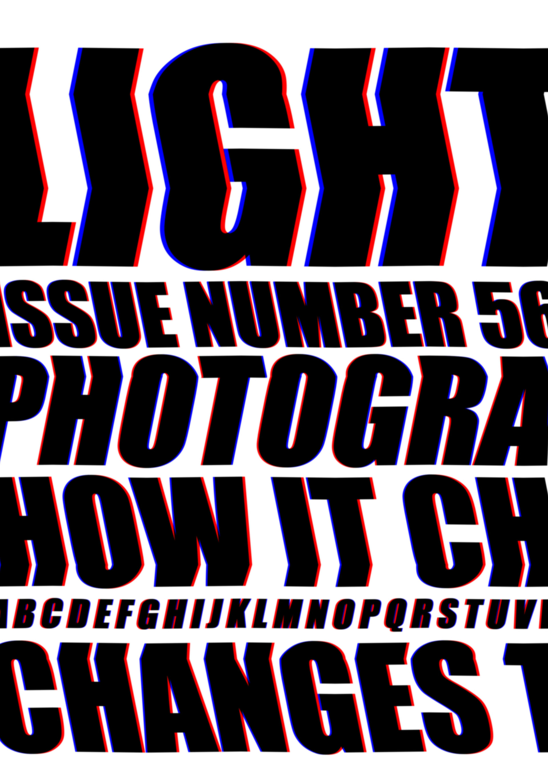
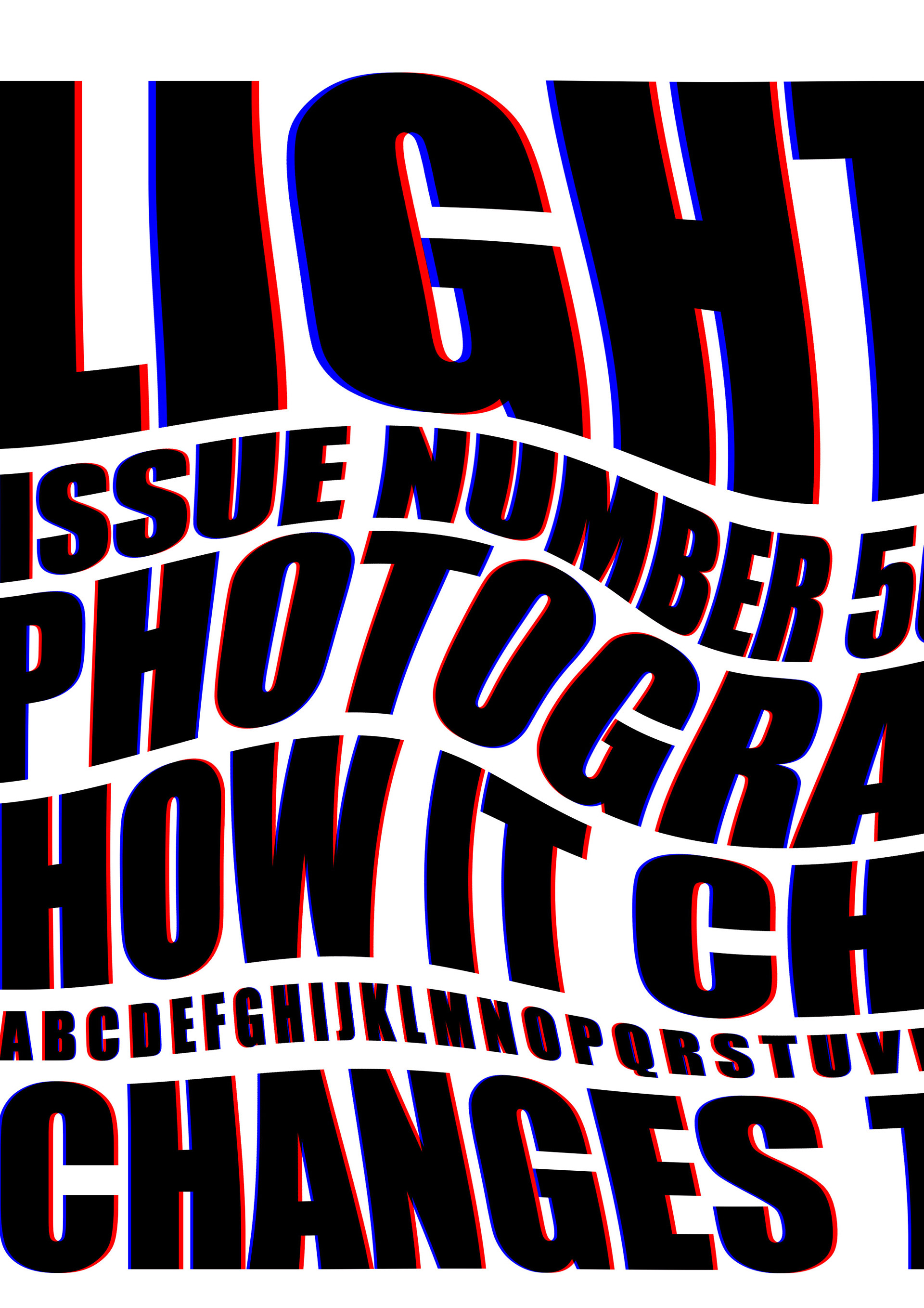
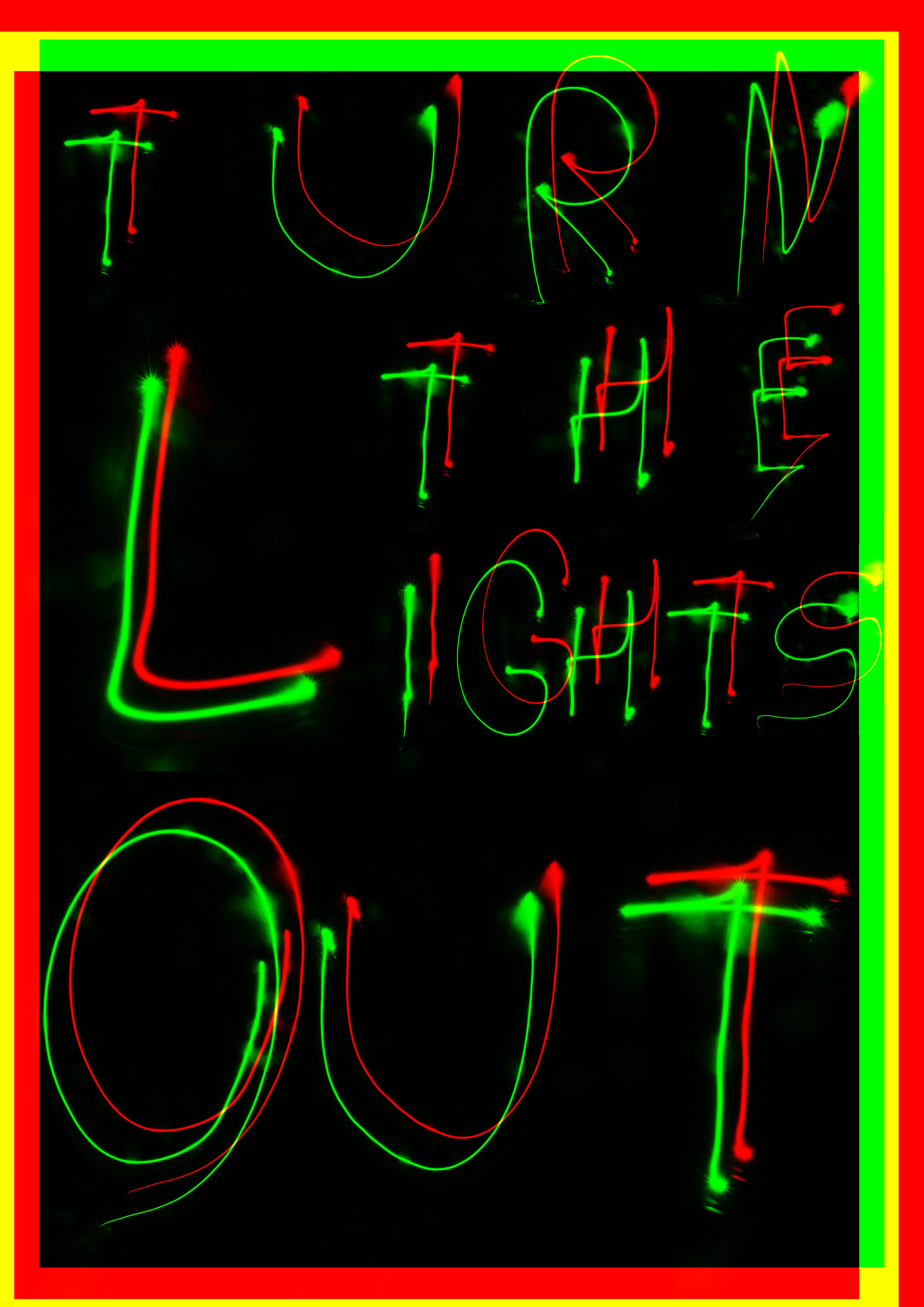
Above are 2 magazine covers that I created for a mock magazine that I was creating. It was called "light" and I used it to display my light photography and conversations that I had created which used the custom typeface that I made. The covers above were created in Photoshop and In Design as I needed these programs to manipulate the font and get the layout to work. The words have a 3D look to them and is supposed to look blurry and this effect was done by adjusting the RGB layers and bringing them out slightly.
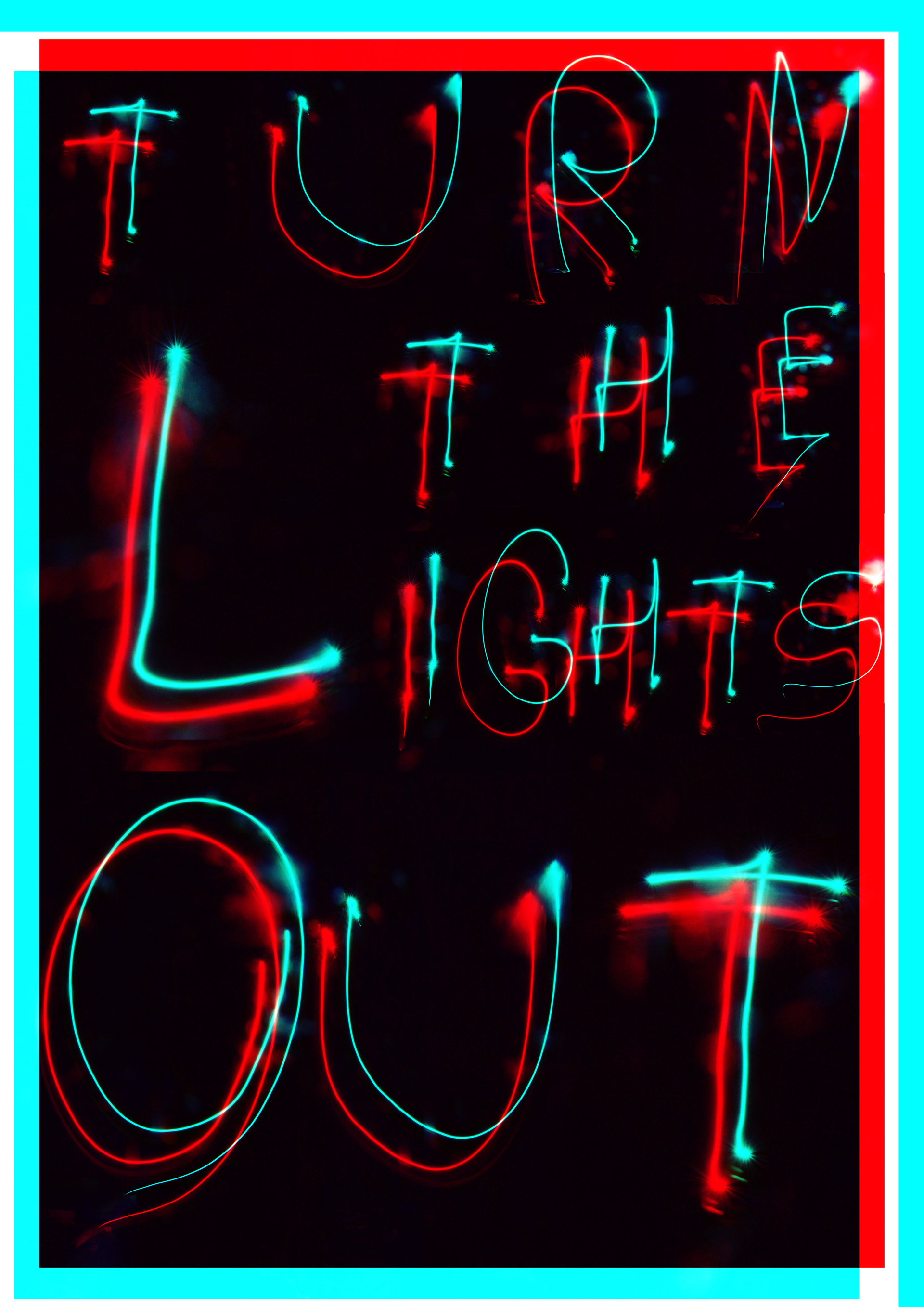
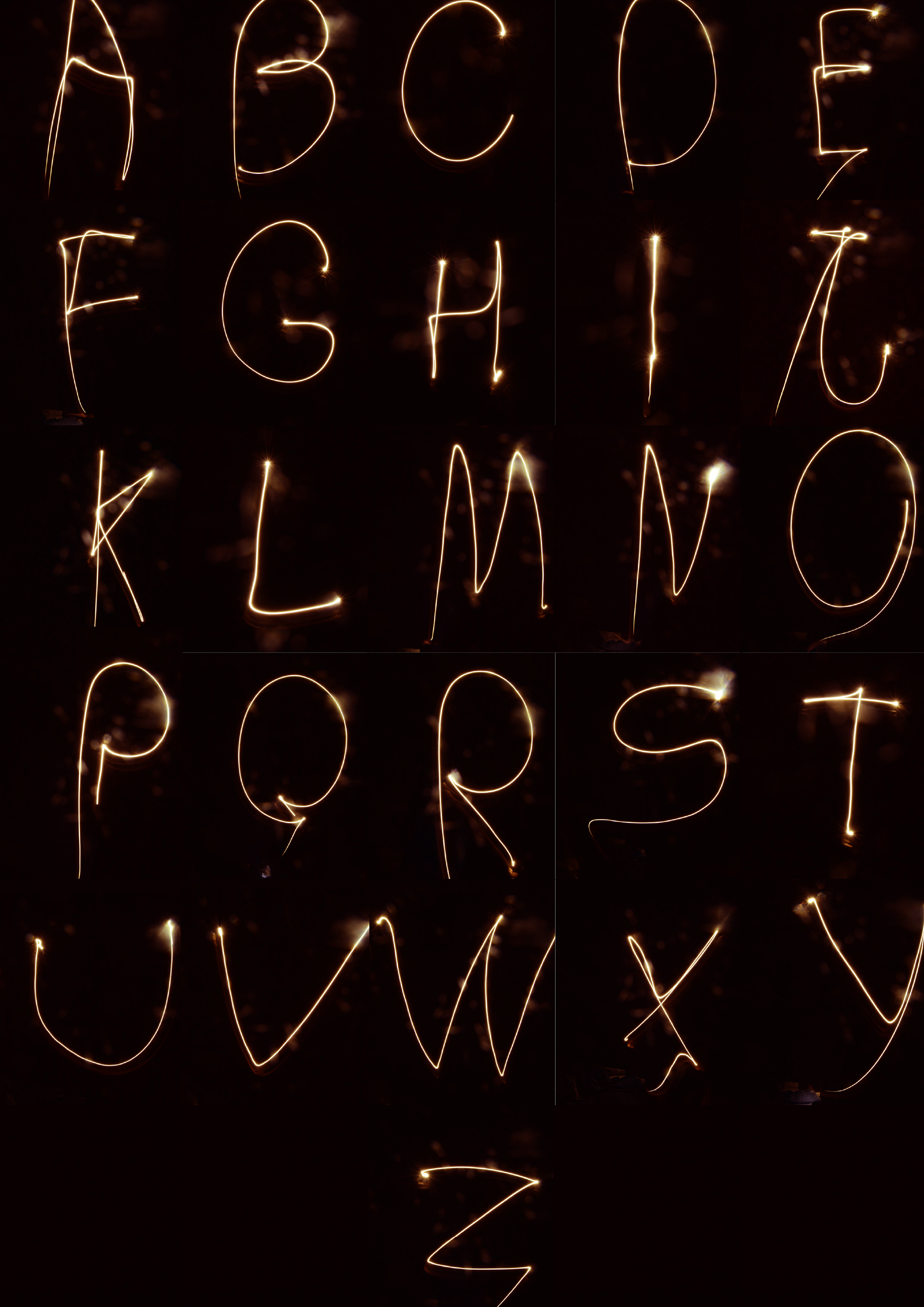
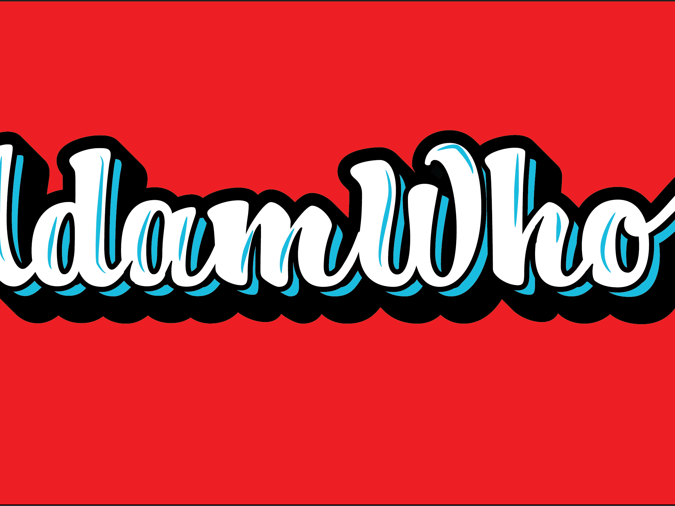
The above images are some conversation edits that I created using the custom letters that I created as well as the actual alphabet which was used. To create this font I used my phone torch and drew out each individual letter in a dark room. It took quite a while but the final alphabet looks very unique and different in my opinion. The reason I chose light photography is so I could explore new medias and not just create digital fonts which anyone can do.
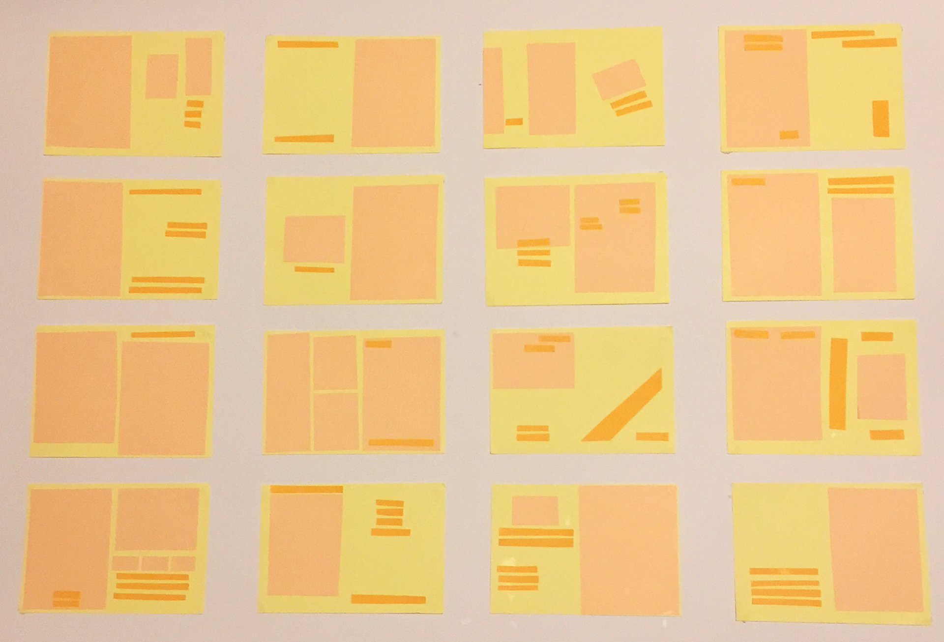
Here is a magazine layout page which I created which was used to help me select possible layouts for my magazine. This was very useful and allowed me to visualise and select the final layouts of my conversation edits which I created. The media I used was card and I made sure to use different colours for each aspect of the magazine. Yellow is back, Orange is text, Pink is Image.